The website’s front-end code is built on the foundation of a 12-column grid system for full-width templates and an 18-column grid for templates with left-hand navigation. With a single code base, Rush’s website can easily and efficiently scale to any device size. Content stacks at smaller sizes in an elegant way which allows users to have a similar experience regardless of whether they are on a desktop computer, tablet or mobile device. Please note the examples below are a visual representation of the grid system, and not the actual stackable HTML-based grid system.
12-Column Grid System
Image
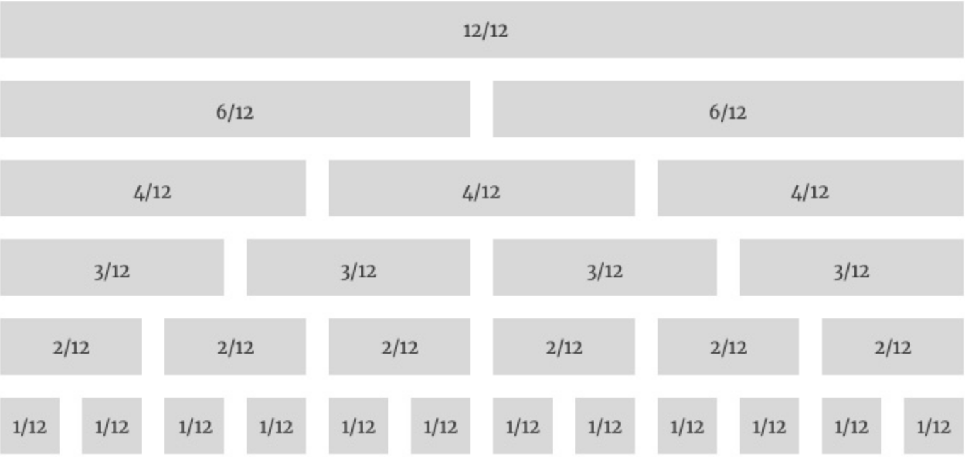
Example 12 Grid Layout
Image

18-Column Grid System
Image
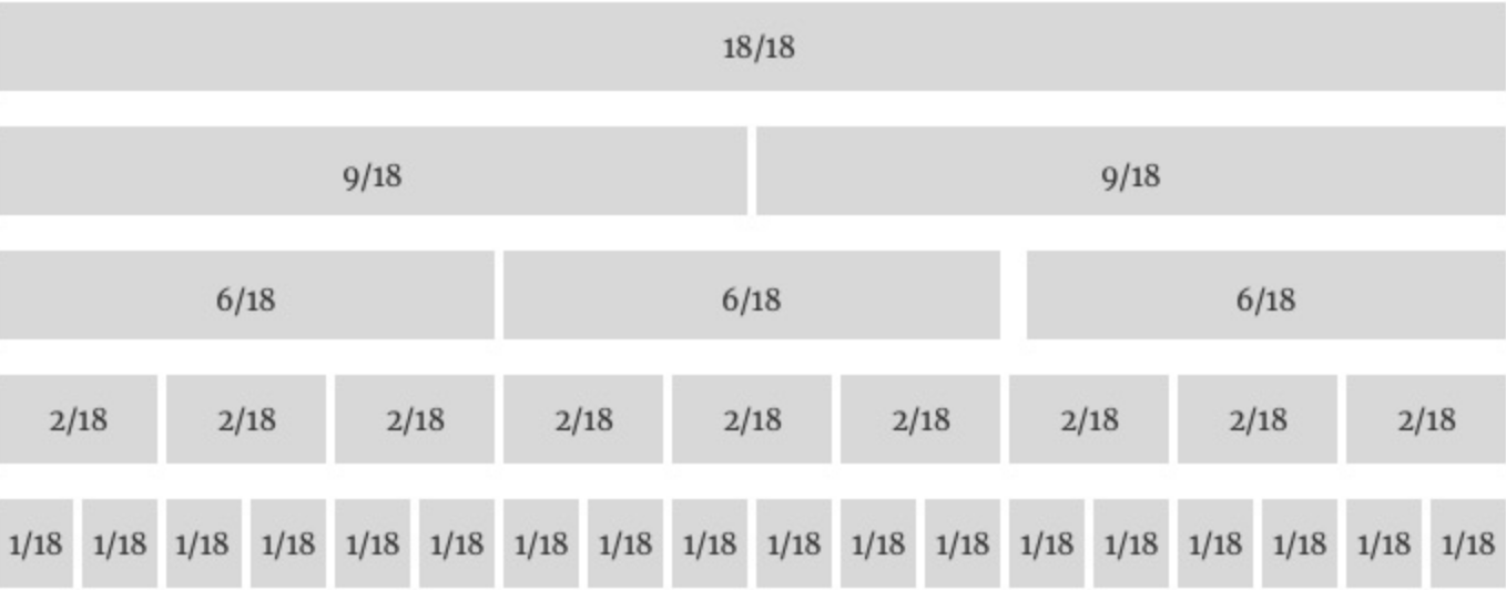
Example 18 Grid Layout
Image
